Self-Guided Demo (20 min.)
Welcome to minware. This written self-guided demo covers everything we normally show on a demo call.
This demo links to live reports. You can view them with your own data (if you’re logged in and ingest is complete), or with demo org data that is anonymized from a real org.
Here is an outline with estimated reading times for each section:
- Background (3 min.)
- What makes minware unique and what it will do for you
- Initial Setup (1 min.)
- The First Report: Hygiene and Traceability (1 min.)
- Editing and Customization (2 min.)
- Actionable, DORA-Inspired Reports (7 min.)
- How frequently are we delivering software?
- How large are our work batches?
- How quickly are we fixing bugs?
- How many bugs are we creating?
- How efficient is the development workflow?
- Higher-Level Reports (3 min.)
- Sprint planning
- Project planning
- Individual contributions
- Next Steps (3 min.)
- Setting Goals and Rolling Out minware
- Additional Reports
Background
Why I Started Minware — Kevin Borders, CEO
Years before my last company reached $86m revenue and sold to private equity, I was demoted from management by my co-founder.
I knew how to build software, but failed to manage our growing team.
After getting serious about planning, software development lifecycle, and quality processes, I got the job back, but it was a long arduous path that lacked a clear roadmap.
I started minware to help others unlock the full potential of people who build software together, without having to start from scratch.
minware reflects the visibility I wish I had from day one to guide me along the path to building a happy, high-performing engineering team.
Before minware: First-Generation Metrics
There are at least 50 other systems that offer basic DORA metrics (deployment frequency, lead time for changes, change failure rate, time to restore service), which we summarize on our competitor comparison page.
Before we started minware, we evaluated these tools too and still decided to invest years of our lives into creating minware.
DORA and other first-generation metrics have the right idea by looking at whether teams ship code frequently in small batches with high quality. They can also broadly tell you if your organization is performing well.
The common complaint about first-generation metrics, however, is that they are lagging indicators that make it difficult to take action because they are disconnected from business value. (For example, if your cycle time is 2 days, what do you actually do to make it better and how much effort should you invest?)
As a result, we frequently hear from customers that they tried DORA but abandoned it in under a year because it failed to show value.
minware’s Edge: Next-Generation Data Models
Others have struggled to create actionable, leading metrics for one reason: it’s hard.
minware’s unique advantage is patent-pending next-generation data models that synthesize the vast sea of low-level software development data into high-level information.
minware’s time model tells you how many hours went into each commit. We trained it using years of manually recorded worklogs so that you get automated results without logging time yourself. (The model is highly accurate. During validation, we found more errors with the time entries than with the model itself!)
minware then rolls up commit time through the vast web of merges, rebases, and ticket links to show what you really care about: active development time per ticket, which we call dev days.
Why does this matter?
Well, going back to cycle time, dev days per ticket is an actionable leading metric that you can directly improve by breaking up tickets into smaller tasks.
Flow efficiency (percentage of time from start to finish with active development) is another metric that you can act on by eliminating bottlenecks that cause context switching.
If you use actionable leading metrics, cycle times will go down, but you won’t have to pore over raw data to figure out how to make it happen.
Only next-generation data models can compute these metrics without painstaking manual logging, so you can get insights without making any changes to the way you work.
Initial Setup
This section covers initial setup for minware in your organization. You can skip it if you’re already up and running or just want to follow along with demo org data.
The first thing you need to do is connect data sources. minware currently supports version control, ticketing, calendar, and CI/CD data sources. For more information about our supported data sources, please see the source integrations documentation.
minware is SOC 2 type 2 certified. We take security seriously and realize that a certification is only a starting point. For more information about our security program, see our security page.
Once you’ve received an email notification that your data has been loaded, you can proceed with configuring your account.
The account configuration documentation provides a detailed guide about how to assign teams, invite minware users, and set their permissions.
If you want to get started without configuration, you can do that too. minware will automatically resolve identities between Git/tickets and group people into teams based on who typically works together in an intelligent way so you can start looking at reports first and double-check the configuration later.
The First Report: Hygiene and Traceability
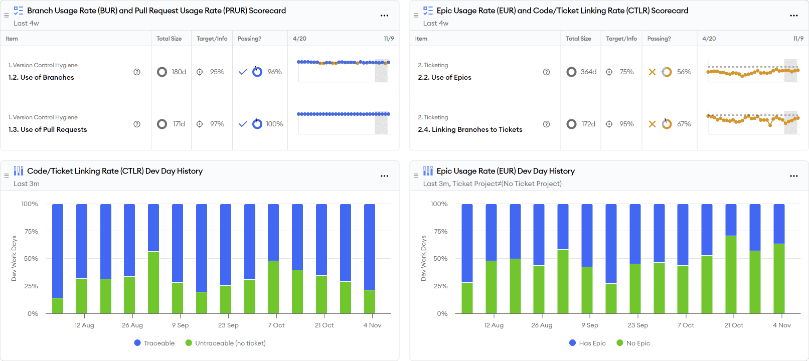
Once your data is hooked up, you can start by looking at the Code/Ticket Hygiene and Traceability report.
This report looks at dev time spent on commits using minware’s time model and measures how much of that time rolls up to branches (i.e., not committing directly to main/master), pull requests, tickets, and epics.
Hygiene and traceability is important because it impacts the accuracy and breadth of coverage in later reports. It also lets you navigate between code changes and tickets directly within those systems.
(Don’t worry if your scores are low to start with though – there’s still a lot that minware’s data models can show even without explicit links between code activity and tickets/projects.)
Tip #1: You can click on the scorecard rows at the top to drill down to individual items and quickly diagnose problems from a top-down view. For example, if you click on “2.4. Linking Branches to Tickets”, you can expand by team, person, and repository to see the amount of time spent working on particular branches that do not contain a ticket ID in the branch name.
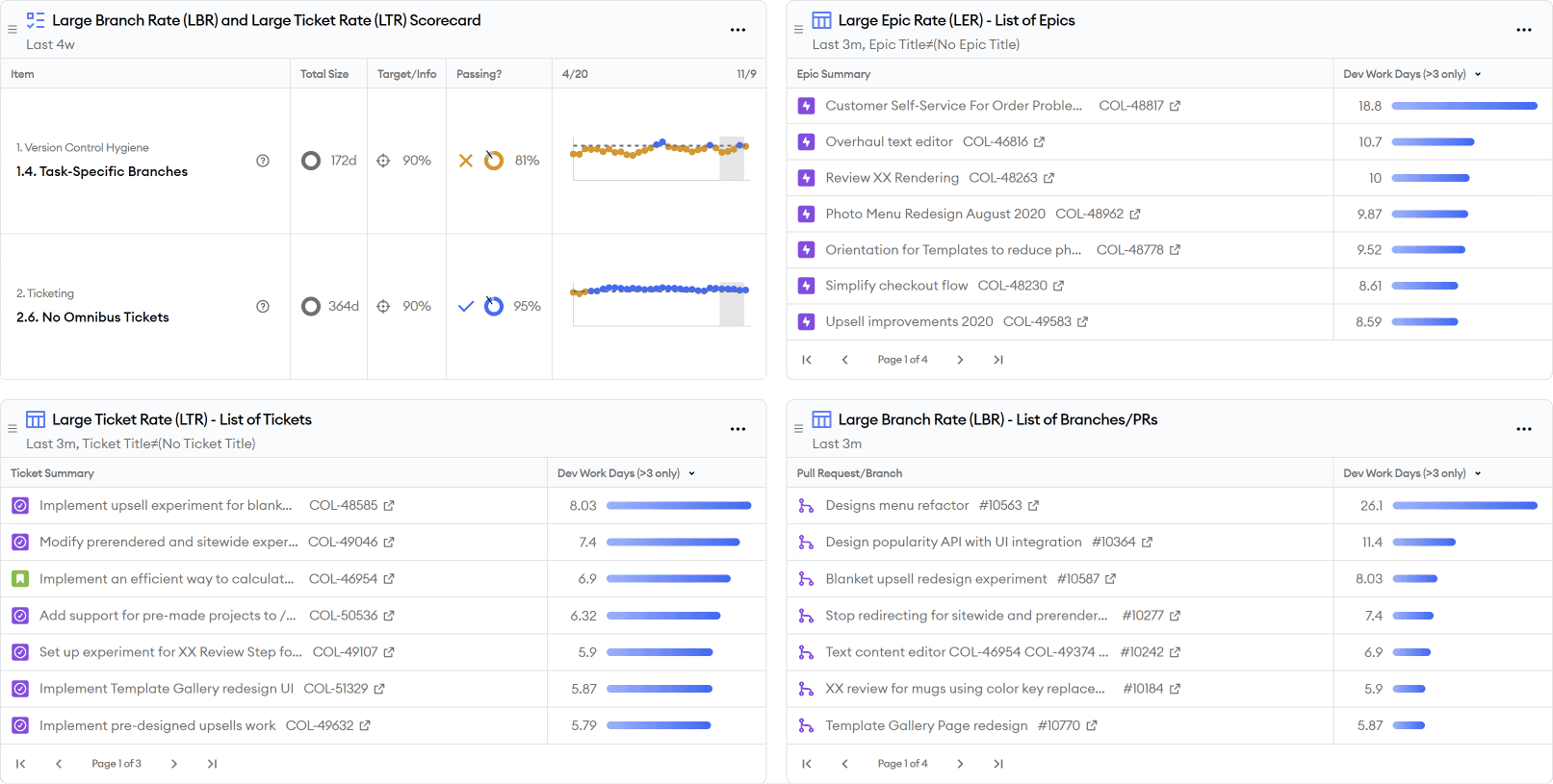
Tip #2: To diagnose problems from a bottom-up view by investigating the biggest untraceable items, the report shows large orphan branches (LOB) and large orphan tickets (LOT) in two tables at the bottom. To sort by size in either table, you can click on the work days heading.
Editing and Customizing Reports
minware’s reports are built on top of a custom dashboard system and are fully editable.
To access and edit the underlying chart or table, simply click on the header in a dashboard widget (e.g., you can click on “Large Orphan Branches” in the hygiene/traceability report.)
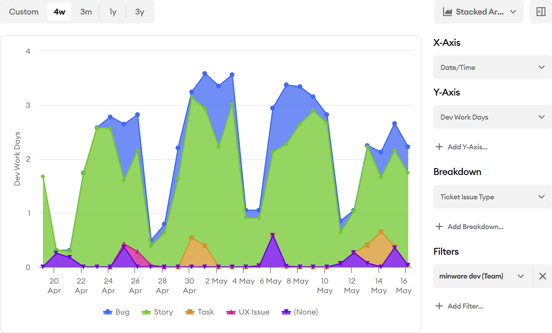
From there, you can configure the chart/table type, filters, x-axis, y-axis, and series values.
Each value is written in minQL – a formula language we created for easily handling complex, time-series data. To view and edit the minQL for any value, you can click on it and select “Edit minQL Formula.”
For more information about minQL, please see the minQL documentation or reach out to support@minware.com for assistance.
Report Parameters
A few reports depend on minQL configuration parameters that you may need to edit.
For example, the MTTR/Bug Resolution Time Report has parameters that let you specify the names of priority levels in your organization representing critical/P1 and urgent/P2.
To set these, you can click on “Ticket is P1 Priority” and then “Update parameter.”
In the window that appears, you can then change == 'Expedited' to the name of your P1 status.
You can also see other parameters that are available by clicking on the “{ } Parameters” button. This lets you define things like issue types that should be treated as bugs (e.g., if you have an “Incident” issue type) and ticket statuses that should count as in-progress or done (e.g., treat bugs as done for the purposes of time-to-restore if they’re in a “post mortem” status).
Actionable, DORA-Inspired Reports
Next, we look at reports inspired by each of the four DORA metrics. These reports include the original DORA metrics, but then add several leading, actionable metrics that make it easier to improve.
To learn more about any of these reports, you can read more by following the report library links below.
Deployments and Throughput
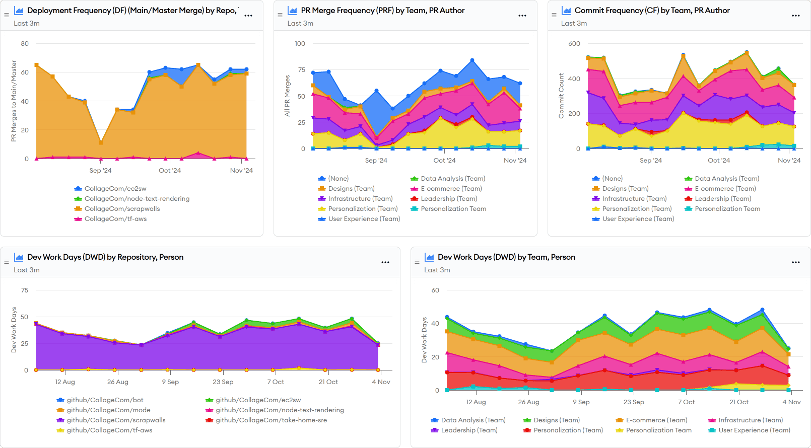
The Deployments and Throughput report shows deployment frequency – the first of the four DORA metrics. It also includes lower-level work items to comprehensively answer the question: how frequently are we delivering software?
While good deployment frequency is important, it’s a high-level output metric and lacks visibility into individual work items.
This report adds charts for the rate of commits, pull requests, and active development work. This helps you verify that work is flowing through the system and spot major changes at each level of granularity.
Note: This report shows main/master merges by default. minware can also pull deployment information from release tags or your CI/CD system. Please contact support@minware.com if you need assistance configuring deployments for your organization.
Work Batch Sizes
The Work Batch Sizes report builds on deployments and throughput to show you the true cadence of software delivery at higher levels of abstraction. This report answers the question: how large are our work batches?
One major problem with deployment frequency is that it can still look good as long as you regularly deploy small fixes even if most development goes into large, undeployed, multi-month projects.
The work batch sizes report uses minware’s time model to show you how many dev days go into pull requests, tickets, and epics so that you can see the biggest opportunities for improvement and work to reduce average batch size at each level.
These actionable leading metrics help you track and improve your true rate of software delivery, not just count low-level deployments.
MTTR/Bug Resolution Time
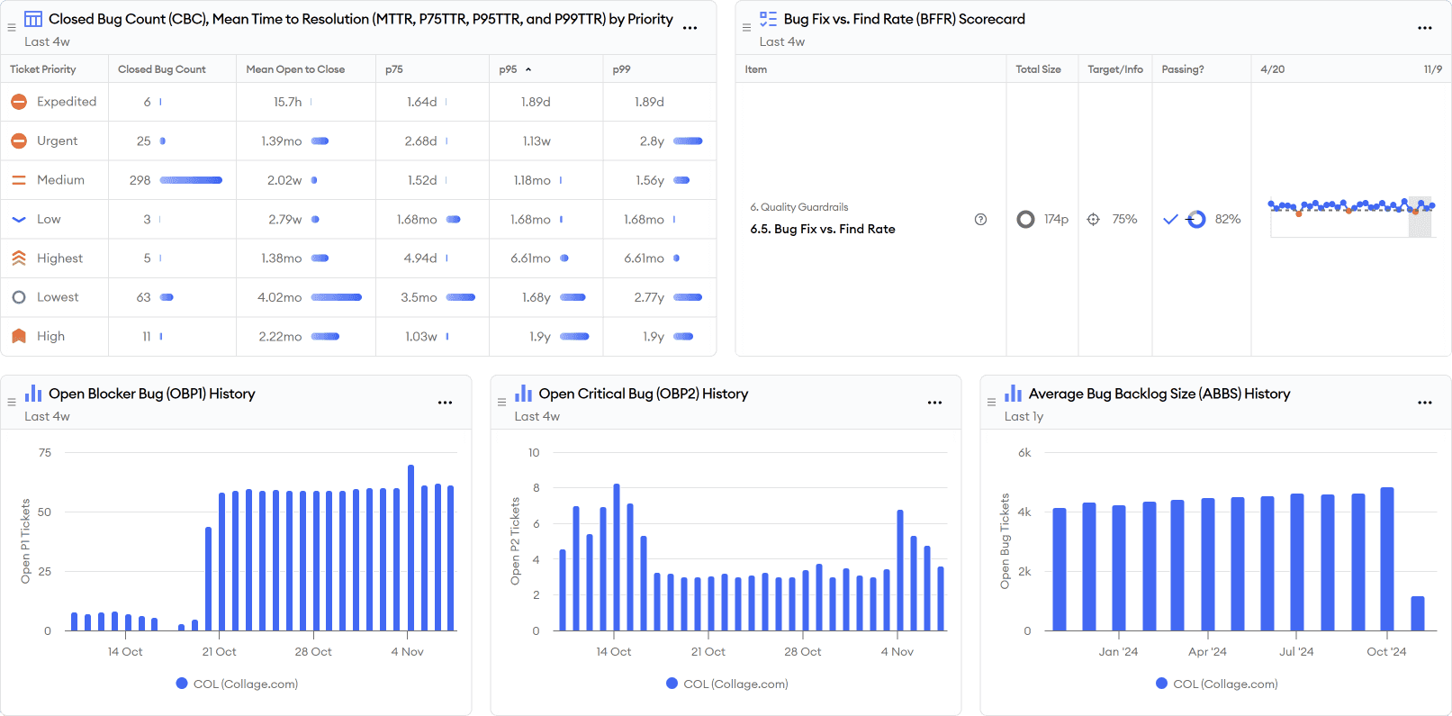
The MTTR/Bug Resolution Time report includes the mean time-to-restore (MTTR) DORA metric along with percentiles, but more broadly answers the question: how quickly are we fixing bugs?
Fixing all bugs (not just the most severe outages) quickly is important for overall productivity. You can read more about why in Want To Ship Features Faster? Fix All Your Bugs.
This report shows mean and percentile open-to-close times for all of your bug priority levels so you can implement and track a bug SLA.
It also shows the number of open high-priority bugs over time so you can spot bug surges that drive up close times.
Finally, it lists currently open bugs and individual long close times so you can drill down and diagnose root causes.
This report further includes bug fix vs. find rate (BFFR) as a guardrail metric. This ensures teams are fixing most new bugs because one undesirable way to improve close times would be to avoid ever fixing difficult bugs.
CFR/Bug Creation
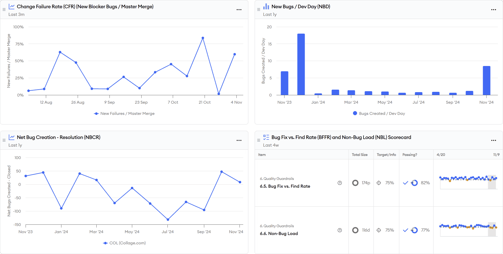
The CFR/Bug Creation report shows the change failure rate (CFR) DORA metric, but expands to answer the deeper question: how many bugs are we creating?
One issue with change failure rate is that it uses total deployments as the denominator. This makes it swing up or down wildly with changes to how frequently you deploy small fixes without reflecting true changes in quality. Perversely, CFR can actually improve if you have more bugs in a release that require additional hotfix deployments.
To address these limitations of CFR, this report adds new bugs per dev day (NBD) which uses the total amount of development activity as the denominator rather than release count.
The report also looks at the total percentage of time that teams spend fixing bugs vs. doing new feature work along with net bug creation minus resolution (NBCR), which indicates whether bugs are burning down or accumulating given the current level of effort.
All together, this report shows the impact of quality problems on velocity to help you make better decisions about fixing tech debt and improving test automation.
Lead/Cycle Time and Workflow
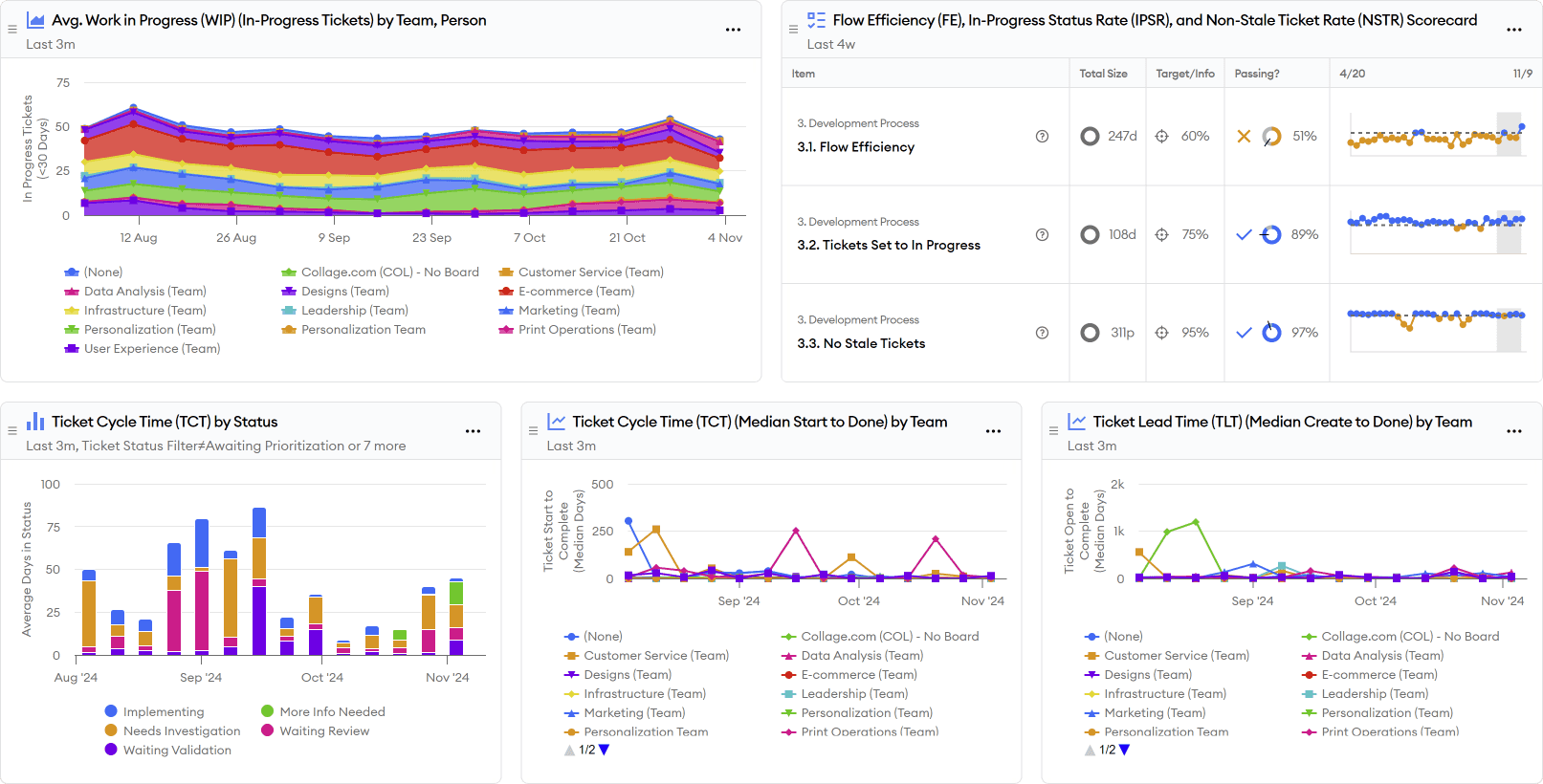
The Lead/Cycle Time and Workflow report includes the final DORA metric: lead time for changes. It expands on the idea to answer the bigger question: how efficient is the development workflow?
Lead/cycle times are important to minimize, but first-generation lead time metrics have a few issues. First, cycle time is really two things multiplied together: work batch size and workflow efficiency. If you look at cycle time alone, it is difficult to tell where problems lie and what to optimize.
The other issue with first-generation lead time metrics is that they look only at code activity. A code change may be complete, but that doesn’t mean that the underlying ticket/task is finished. A task may require multiple code changes, feature flag enablement, or post-launch validation. The true lead time that matters is at the ticket level, which requires advanced data models to provide a view across code and tickets.
To answer the deeper workflow efficiency question, this report starts by showing work-in-progress at the ticket level. The chart displays data by team, and you can drill into a series by clicking on it to display work in progress by person.
The great thing about looking at work in progress (WIP) by person is that it’s easy to see where you have room for improvement. If the WIP is close to one, then there’s little room to get better. If some people have WIP over 2-3, you know there’s a problem and can dig in to uncover the bottlenecks.
This report also provides a breakdown of pull request stage and ticket status so you can see which steps are causing the delays.
It further shows a chart of lead time percentiles, which tells you whether the problem is mainly with particularly slow changes, or if changes are slow across the board.
Finally, it lists the longest tickets and pull requests so that you can assess the root causes of the biggest offenders.
Higher-Level Reports
The ideas behind DORA are helpful for improving your software development process, but they are only part of the puzzle.
As you move beyond DORA, you will want to look at planning efficiency and individual coaching to provide a holistic view of engineering health
Sprint Best Practices
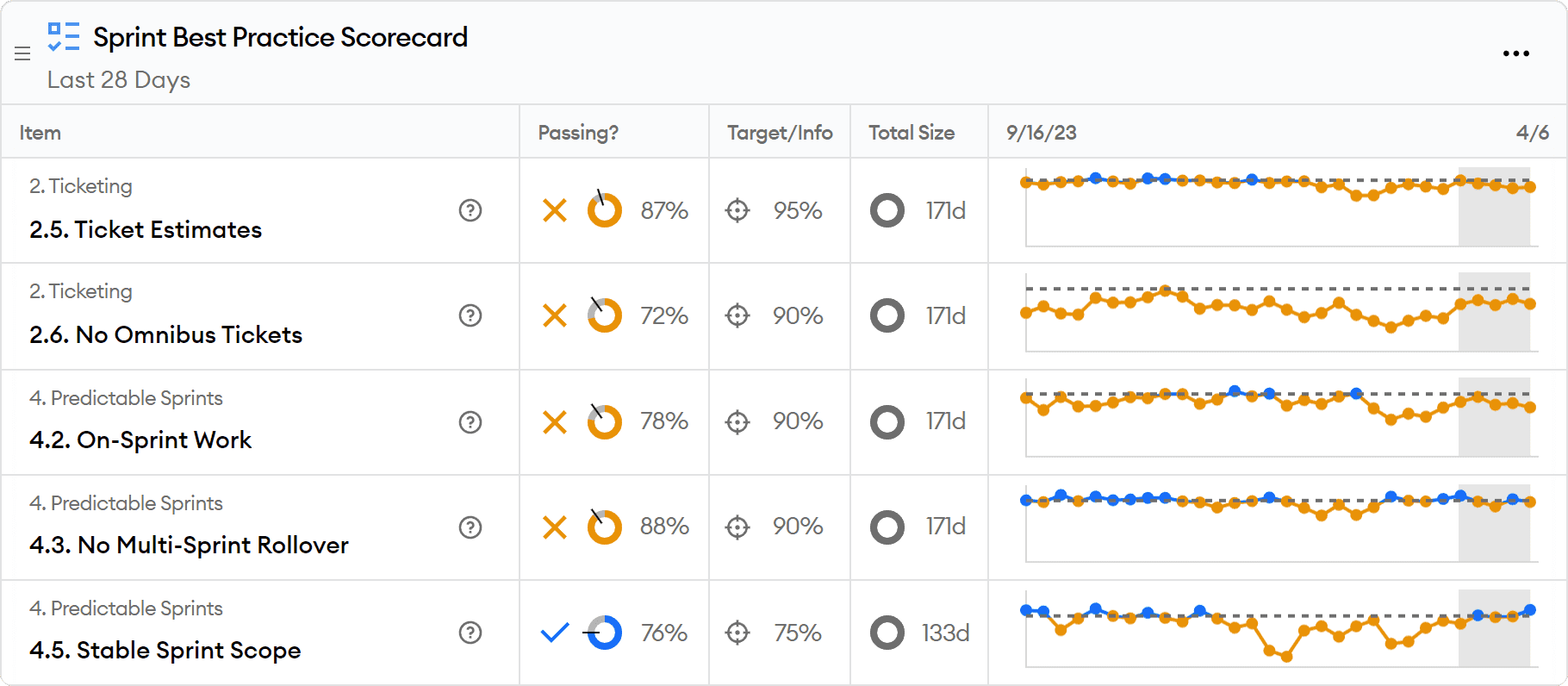
The Sprint Best Practices report covers several best practices related to sprint planning for teams doing sprints or following a scrum process.
You can read more about which sprint processes are right for your team in To Sprint, or Not To Sprint.
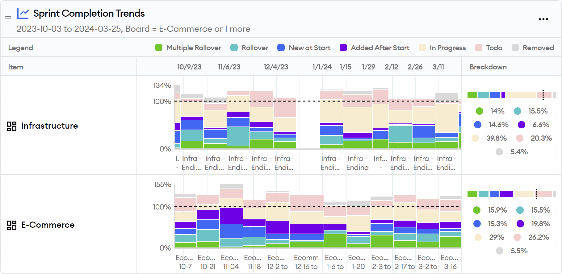
This report includes a scorecard for basic practices like adding estimates to tickets and putting active tickets in sprints, as well as more advanced metrics like whether tickets are rolling over or getting added after the start of the sprint.
The report also includes a historical chart of completed vs. committed points, further breaking down completed work by rollover count or late additions to the sprint.
If you’re interested in digging deeper, there are a lot more advanced sprint metrics you may want to consider, which you can read about in Advanced Sprint Metrics Are for Everyone.
Project Completion Tracking
Sprints are helpful for short-term planning, but you may also have larger projects that you want to track.
The Project Completion Tracker report shows you everything you want to know about progress at the epic level.
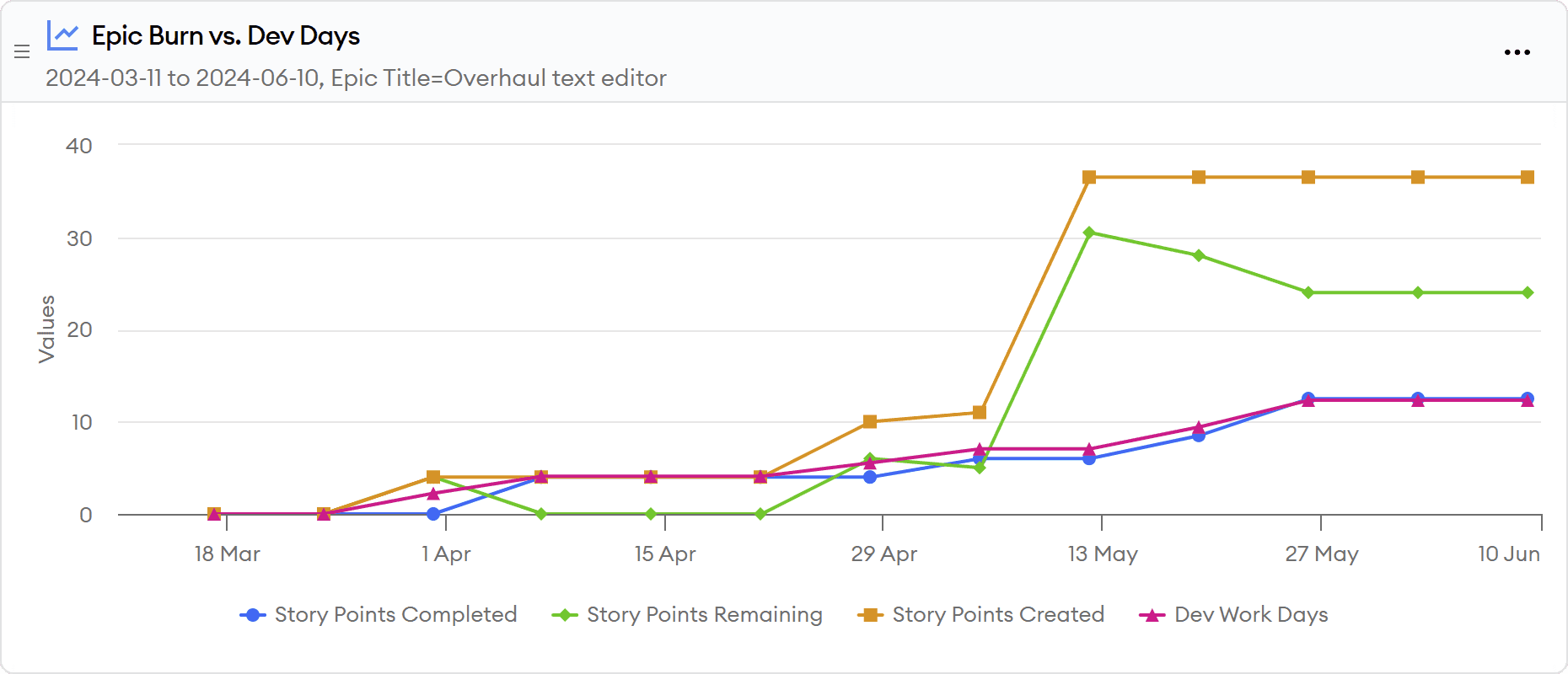
It first includes a burn chart that shows cumulative ticket creation and completion alongside total active development effort.
This makes it easy to see if changes in progress are due to varying levels of effort, difficulty of completing tasks, or scope creep. From this view, you can also extrapolate the trajectory to see when the project is on track to complete based on the current rate of work.
Finally, the report shows a historical chart of development effort by person, as well as a list of individual completed and outstanding tickets associated with the epic.
Individual Contributions
The last report we will cover in the welcome guide is the Individual Contributions report.
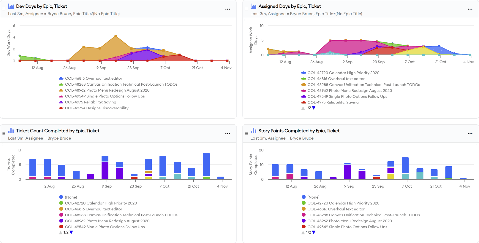
This report showcases all of a person’s code, ticket, and review contributions in one place so that it’s easy for managers and engineers to see their contributions without having to hunt for data across multiple systems.
It is helpful for one-on-one meetings to see when someone might be getting stuck or observe improvements over time.
This report is also useful for performance reviews to make sure all of a person’s contributions are considered, particularly if they contribute in less visible ways like reviewing code and creating tickets.
Next Steps
Now that you have seen the most popular reports and overall capabilities of minware, we recommend a few next steps to get started improving your engineering team.
After viewing the initial reports and drilling down into scorecard items, you may want to revisit account configuration to do things like assign people to different teams if automatic team assignment put some people in the wrong place. Contact us at support@minware.com if you need any deeper non-standard configuration, like treating certain in-progress statuses as done.
You can also pin any of the reports that you want to view on a regular basis by clicking on the “...” menu in the upper-right corner of the report.
You can modify and customize the reports as well, such as by adding team filters or setting parameters. Any changes you save will be added as a new dashboard in your account.
Setting Goals and Rolling Out minware
Teams that have the most success with minware set a small number of achievable goals to help the team focus on a few areas at a time.
For example, you may find after reviewing the reports that you want to establish a bug SLA and drive down close time for particular priority levels, or decrease ticket sizes by breaking down large tickets.
To do this, you can create a report that includes just the items you care about and share it with each manager so that they can easily track their overall progress and drill down into individual items that are impacting the metric.
We strongly recommend establishing a review cadence at each level.
For example, teams may want to review a task size report during each sprint retrospective so that they can discuss the root cause of individual outliers and work to improve the metric.
You can then host a monthly metrics review with managers and senior leadership to discuss overall progress and cover action items that teams have identified where they need support from the organization or platform team, such as getting better business requirements or improving the build process.
Finally, you may want to revisit and adjust goals on a longer cadence (e.g., quarterly) so that the team shifts focus as they overcome current challenges and move on to the next level.
(If your organization is complex and there are many stakeholders involved, you may want to review our more detailed adoption guide.)
Additional Reports
This guide covered the most popular use cases, but minware offers reports for many other topics. You can view them all in the report library.
Here are some others you may want to visit first:
- Project Cost Allocation - See where time was spent and report on capitalizable activity for accounting.
- Tech Debt Measurement - See the impact that tech debt is having on development in the form of bugs and estimate misses.
- Sprint Insights - Highly detailed view that analyzes all the activity and ticket estimate accuracy within the scope of an individual sprint.
- Ticket Status Workflow - Drill down into where time was spent by ticket status, common status transitions, and bounce-backs.
- Meeting Management - View time spent in meetings and the impact of meetings on development productivity.
- CI/CD Pipeline Performance - Dig into CI/CD metrics that affect productivity, such as pipeline run time, failure rate, and downtime.
- minQL Property Reference - List all available properties and values in your data for use in custom minQL formulas.

